Key Responsibilities
Design System Implementation: Managed the implementation of Material 3, adapting the design system to align with the client's brand, ensuring consistency across platforms.
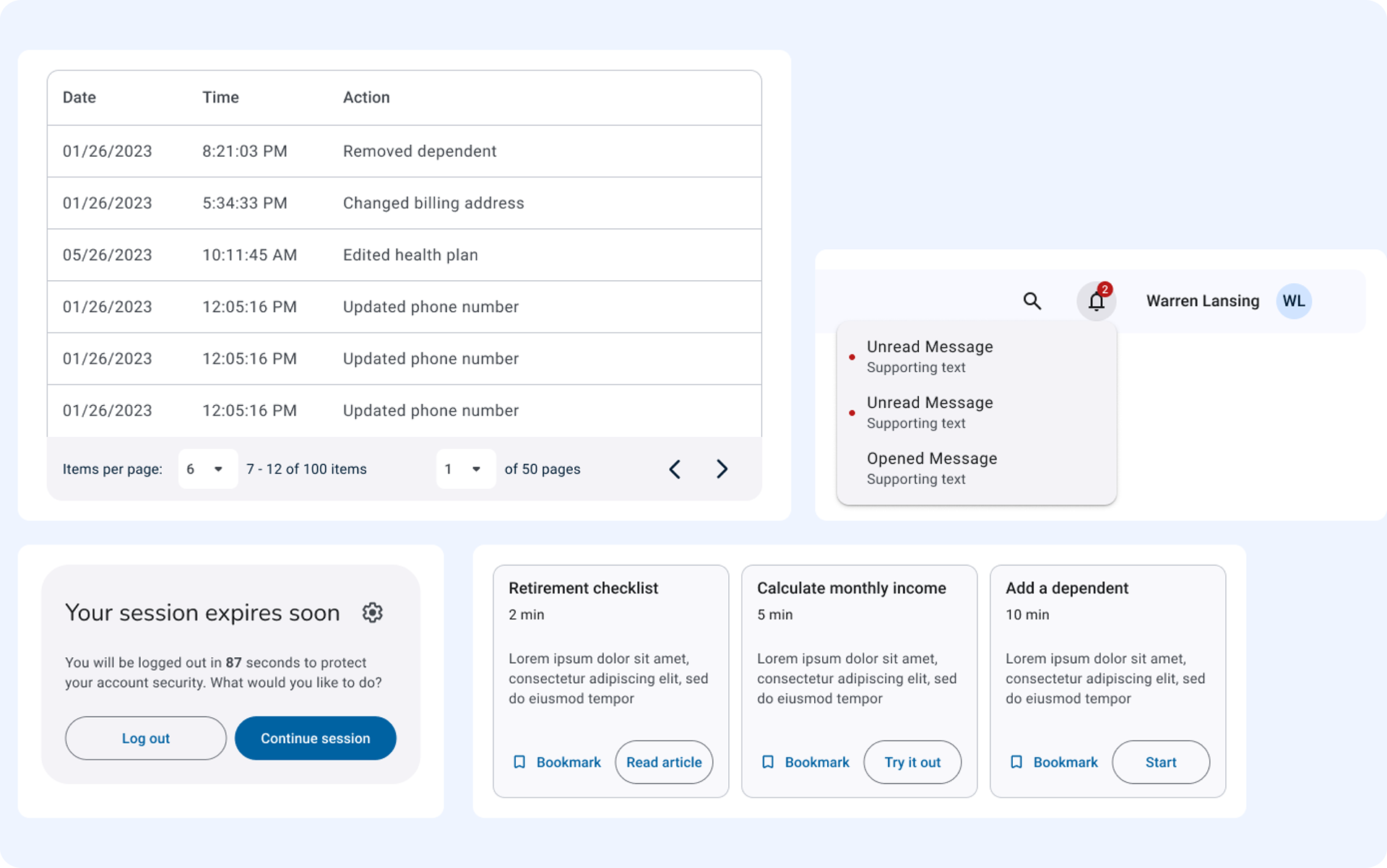
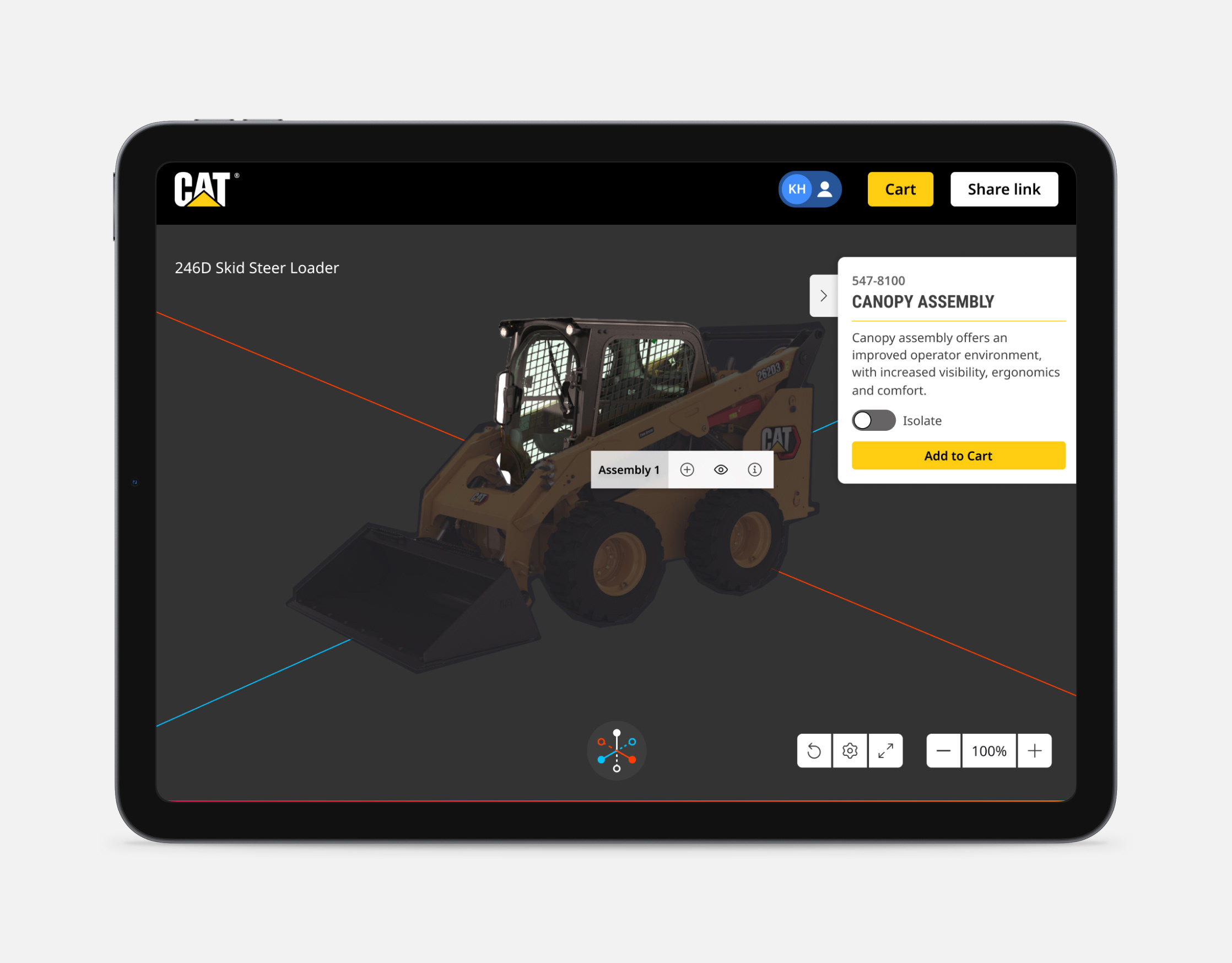
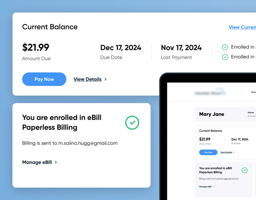
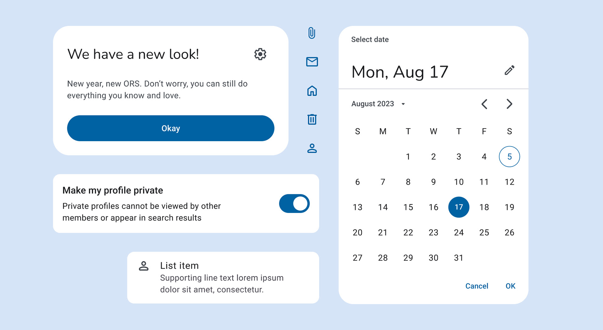
Component Documentation and Guidelines: Together, we created detailed documentation for each component, outlining its structure, states, behavior, and accessibility guidelines, enabling seamless adoption by both designers and developers.
Scalability and Maintenance: We ensured that the component library was designed for scalability and easy maintenance, allowing it to evolve with the product while staying cohesive across various platforms and projects.
Through the creation of reusable components the team aimed to improve efficiency and scalability, reducing redundant work. Also standardized components improved collaboration and alignment between design, development, and production teams.
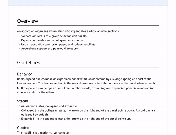
Documentation Structure
Each component included a usage guide and an accessibility guide. The usage guide featured an overview of the component, guidelines detailing its behavior, states, content, and responsiveness, as well as an anatomy section, naming each part and describing its function along with relevant use cases. In the accessibility guide, we based the documentation on WCAG 2.0 AA standards, addressing critical areas such as interaction and style, focus, keyboard navigation, and labeling rules.
This comprehensive approach ensured that users could effectively utilize the components while maintaining an inclusive experience for all.
Delivering to production and tech team
We delivered a comprehensive library overview that included accessibility notes and a detailed description of what users could find within the library. We also provided notes for the development team, which included a short guide on how to use Figma as a developer. Our delivery comprised a total of 30 components, each accompanied by a usage guide and an accessibility guide. Furthermore, we created a style guide that encompassed colors, typography, iconography, and grids, ensuring a cohesive visual identity across all design elements. This structured approach facilitated a user-friendly experience while supporting effective collaboration and accessibility compliance.