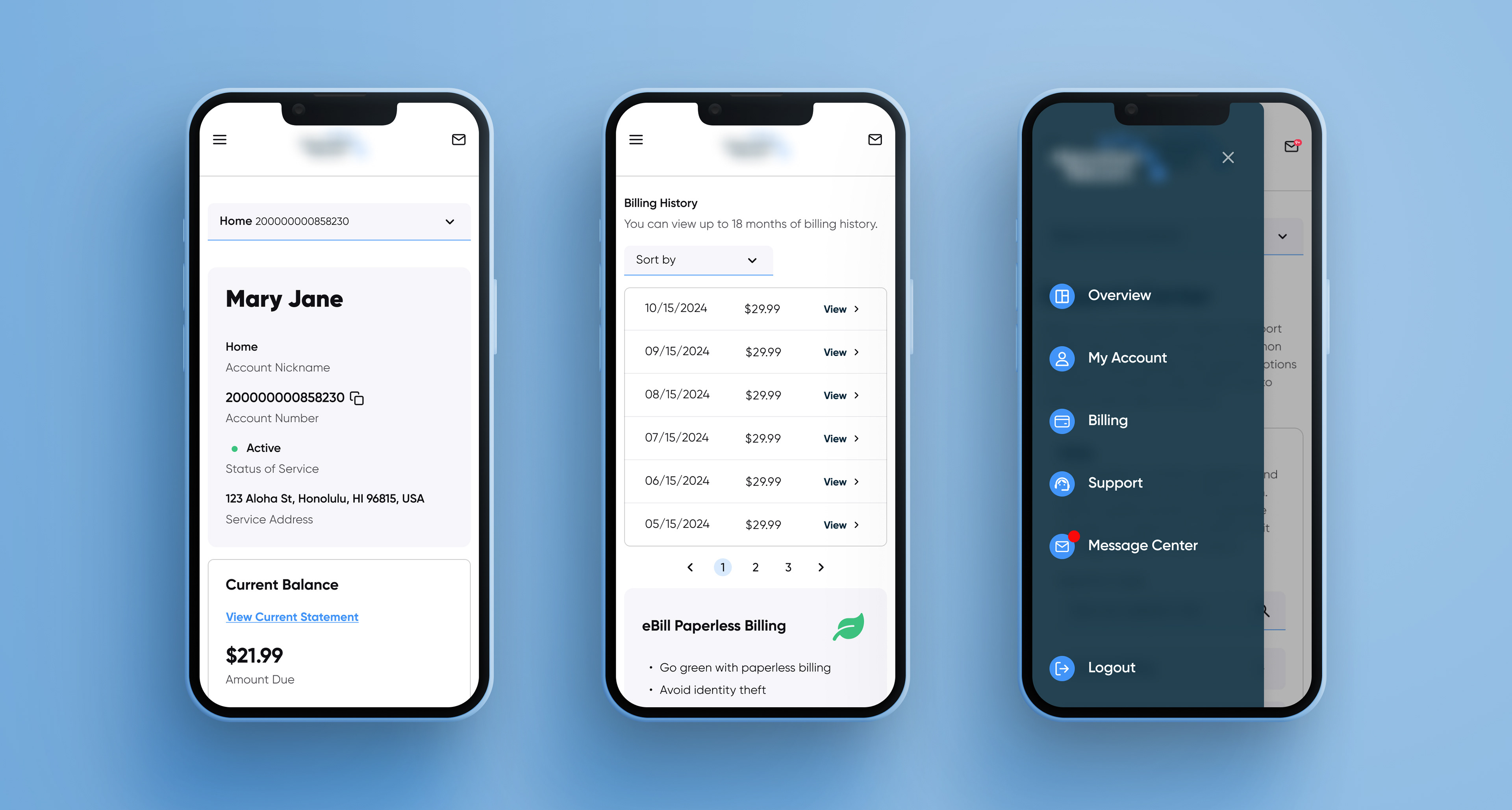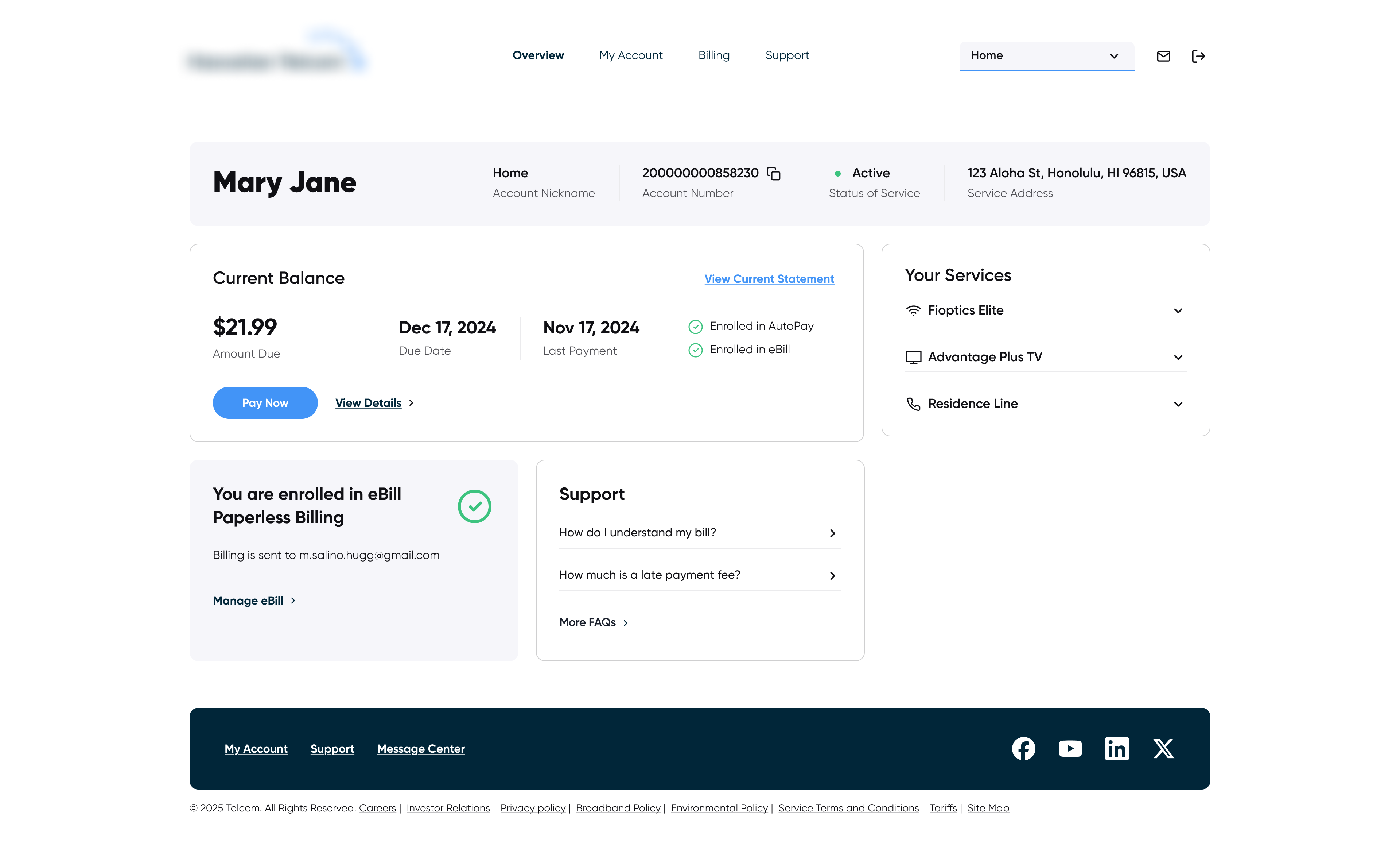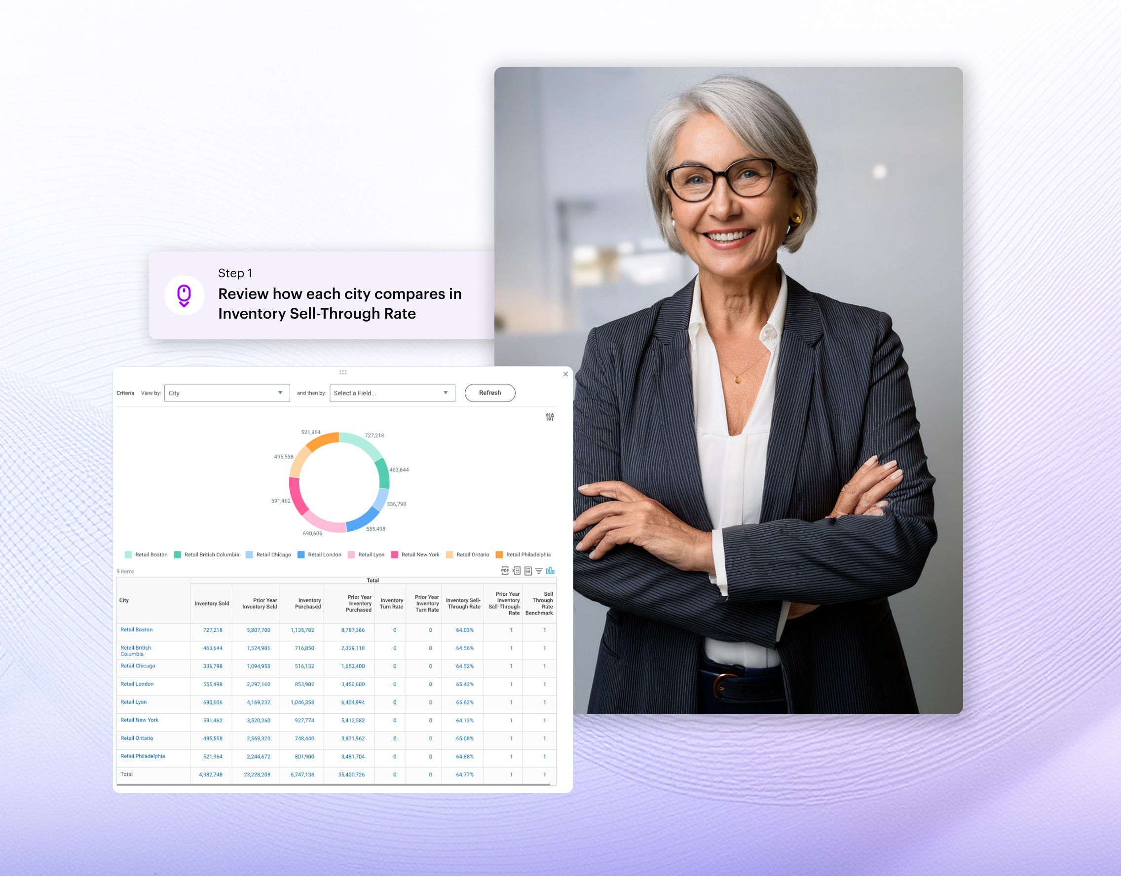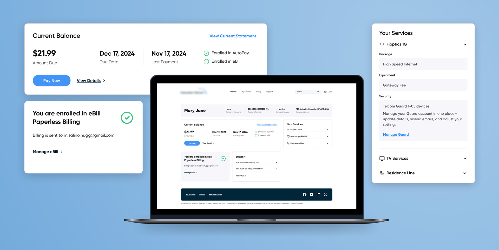
We worked on the redesign for account management of a Telecom service. Our goal was to create a modern clean look that not only looked good but also improve user understanding of their account billing details.
One of the goals for this enhancement was to increase self-service adoption and to reduce support tickets.
One of the goals for this enhancement was to increase self-service adoption and to reduce support tickets.
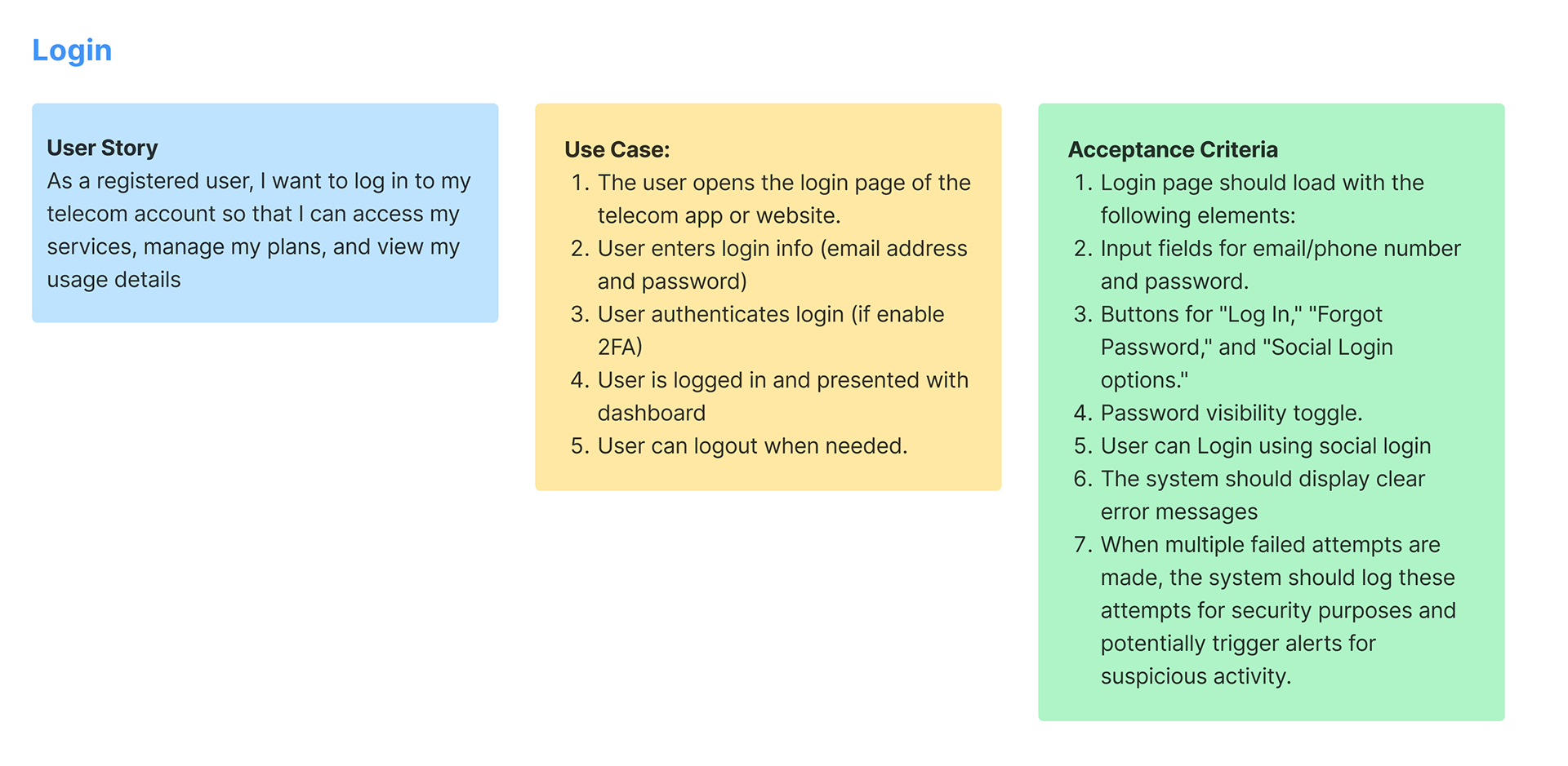
Writing Use Cases
For this project we didn't have contact with the final user so the best way to close the gap between UX and UI was writing +8 flow documentation framework that served as the source of truth. This work was done before designing any high-fi screen. By creating this use cases we ensured every UI state was accounted for and reduced design debt. The use cases included:
User Story: which defined the "why"
Use Case: mapping the "how"
Acceptance Criteria: defining the "what"
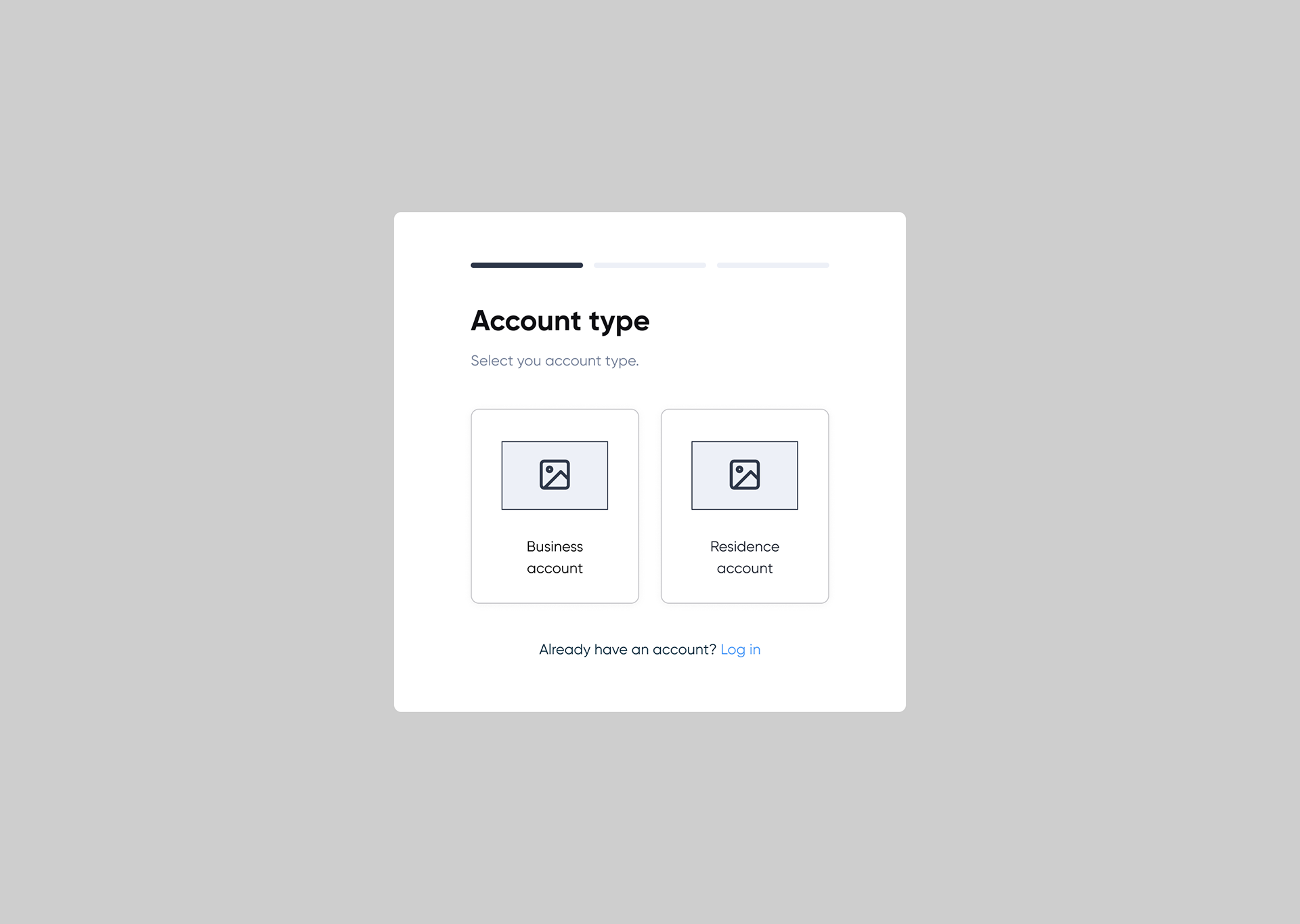
Low fi-mokcups
Responsive screens with code
To ensure efficient handoff for development across desktop and mobile breakpoints, the design team was ask to deliver responsive code-ready screens using Figma's advanced variables and autolayout features.